

A SaaS onboarding flow exists to get a new user to their first meaningful outcome, the activation event, as fast as honestly possible. Time-to-value and activation rate are the two numbers that tell you whether it's working. Get a user to real value inside minutes and you're playing a different game than a competitor who takes days, because that speed compounds directly into retention and lifetime value. Everything below is the mechanics of how to build that.
TL;DR:
- Achieving a time-to-value under five minutes and an activation rate between 40 to 60 percent is crucial for fast SaaS onboarding success.
- The onboarding process should be divided into three phases: orient within 60 seconds, activate through guided actions within five minutes, and reinforce over days or weeks with targeted nudges.
- Use case and plan tier routing should be limited to one or two questions to keep onboarding complexity manageable and maintenance feasible.
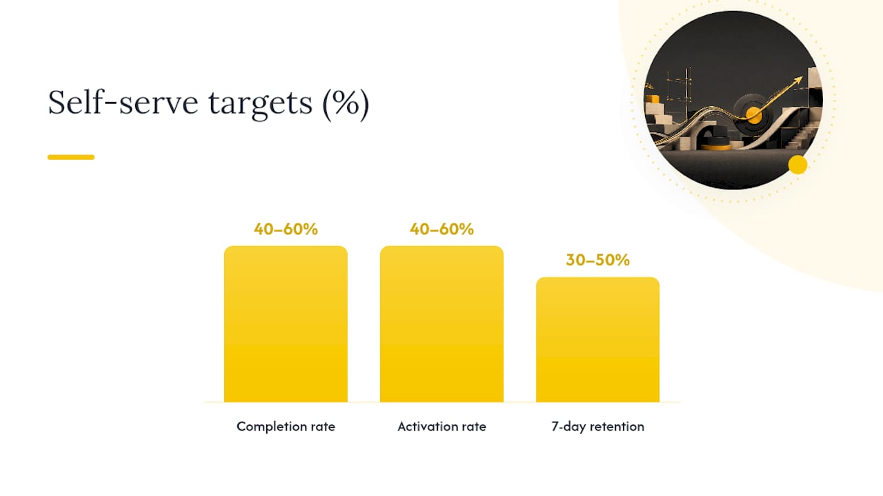
- Key metrics such as completion rate, activation rate, and 7-day retention should be precisely tracked to identify where leaks occur and measure improvements effectively.
- Building a minimal, well-defined onboarding flow from a proven prototype as fixed-scope, quickly delivered code is often faster and more reliable than extensive DIY or no-code solutions.
Table of Contents
- What Is a SaaS Onboarding Flow, and Why Does It Matter?
- The Anatomy of Effective SaaS Onboarding: Orient, Activate, Reinforce
- How Do You Design an Onboarding Flow That Reaches Value Fast?
- Personalization and Segmentation: Routing by Role and Intent Without Overbuilding It
- Measure Onboarding: Metrics, Targets, and How to Compute Them
- Channels and Touchpoints: Orchestrating In-App, Email, and Human Support
- Implementation Notes: Minimal Stack, Integrations, Security, and Instrumentation
- Common Anti-Patterns and Fixes That Move the Needle Fast
- How Should You A/B Test and Iterate on Onboarding?
- Author Notes: What I Trade Off When I Build Onboarding for Single-Engineer Projects
- Get a Fixed-Price Onboarding Build That Ships in Weeks
- Sources
- FAQ
What Is a SaaS Onboarding Flow, and Why Does It Matter?
A SaaS onboarding flow is the sequence of screens, prompts, emails, and nudges that takes a brand-new signup from "I have no idea how this works" to "I just got something useful out of this." That's it. Not a tour. Not a feature tour disguised as a tour. A path to one specific, measurable outcome.
The stakes are higher than most product teams treat them. Strong onboarding reduces churn by 20 to 50 percent, and a one percentage point rise in activation rate tends to track with roughly two percentage points less churn down the line. That ratio is why onboarding gets disproportionate attention from product teams that have actually looked at their cohort data: it's not a "nice UX polish" problem, it's a revenue-retention lever with a multiplier attached.
Here's the standard industry vocabulary you'll want, because it shows up constantly in analytics dashboards and product reviews: activation is the moment a user experiences your core value for the first time (sends the first message, generates the first report, invites the first teammate). Time-to-value (TTV) is how long that takes from signup. Completion rate is the percentage of users who finish whatever onboarding sequence you've defined. 7-day retention tracks whether they came back. These four metrics, paired with a clear checklist and visible progress indicators, are the trust signals that separate a flow you can optimize from a flow you're just guessing about.
Effective SaaS onboarding, done well, targets a time-to-value under five minutes and an activation rate somewhere in the 40 to 60 percent range. Miss that window and you're not failing gracefully, you're losing users who never gave your product a real chance.
The Anatomy of Effective SaaS Onboarding: Orient, Activate, Reinforce
Most onboarding advice treats the whole experience as one blob: "make it smooth," "reduce friction," "personalize it." That's not specific enough to build from. The onboarding process for SaaS products that actually works breaks into three distinct phases, each with its own goal, its own timing window, and its own failure mode. This three-phase structure is a recognized framework among people who study onboarding closely, and it maps cleanly onto how attention and motivation actually behave in a new user's first session.
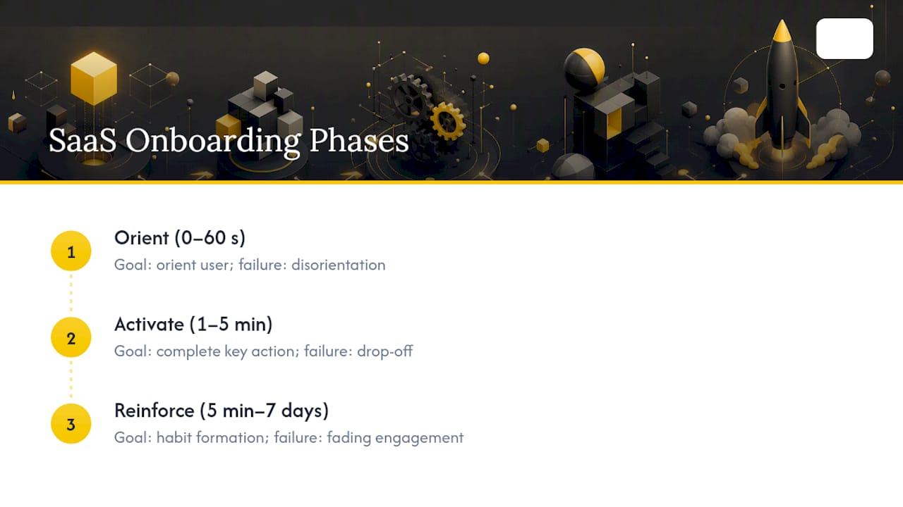
Orient (0 to 60 seconds)
This is the welcome screen, the role or intent prompt, and the moment you set expectations. The user just signed up. They don't know your product's mental model yet, and they're deciding, often unconsciously, whether to keep going or bail.
Your only job here is to answer two questions fast: "What is this for?" and "What do I do first?" A one or two question intent prompt (are you here for X or Y?) belongs here, because it lets you route the rest of the experience without demanding a full profile. Anything longer than that, and you're spending the user's patience budget before they've gotten anything back.
Activate (1 to 5 minutes)
This is the guided action that produces the first real outcome. Not a demo of the outcome, the actual outcome. This is where "forced first action" patterns earn their reputation: Loom doesn't let you leave the onboarding without recording a real video, because a recorded video is the product, not a preview of it.
The activate phase is where most flows quietly fail, usually by asking the user to configure something before they've experienced anything. Configuration is not activation. If your onboarding asks someone to set up integrations, invite a team, or fill out a profile before they've touched the core value, you've inverted the order and you're paying for it in drop-off.
Reinforce (5 minutes to 7 days)
Activation isn't the finish line, it's the starting gun for habit formation. This phase covers persistent checklists, contextual tooltips that show up exactly when a feature becomes relevant, lifecycle emails, and small nudges that pull a user back into a second and third session.
This is also where the Fogg Behavior Model is worth knowing, even if you never read the academic version. Behavior happens when trigger, motivation, and ability line up at the same moment. A checklist item is a trigger. First-session momentum is motivation. A well-designed UI is ability. Reinforcement design is mostly about placing triggers exactly when ability is highest, not blasting reminders on a generic schedule.
Progressive disclosure and sequencing
The rule underneath all three phases: show the minimum needed for the current step, and reveal complexity only when it's relevant to what the user is trying to do right now. A billing settings page doesn't belong in front of someone who hasn't sent their first message yet. Sequence by relevance, not by your internal information architecture. If a setting doesn't affect the next five minutes of the user's experience, it can wait, and putting it in front of them early is friction with no payoff attached.
How Do You Design an Onboarding Flow That Reaches Value Fast?
Building a SaaS onboarding checklist that actually gets used starts with a decision, not a design tool. You need to know exactly what "first value" means for your product before you draw a single screen.
1. Define the activation event precisely. Write it as a sentence a user could complete: "The user has sent their first invoice," not "the user understands billing." If you can't state it in one sentence with a concrete noun, you haven't defined it yet, you've defined a feeling.
2. Identify the minimum set of actions required to reach that event. List every field, click, and screen currently standing between signup and activation. Most teams are shocked at how long this list is once they actually write it down, because features accumulate screens over time and nobody goes back to prune them.
3. Cut anything that isn't strictly required. This is the step teams skip because it's uncomfortable. If a field can be defaulted, default it. If a screen can be deferred until after activation, defer it. If a step exists because "that's how it's always been," that's not a reason.
4. Add role or intent routing, but cap it at one or two questions. More on this in the next section, but the short version: routing should shorten the path, never lengthen it with a survey.
5. Force a first artifact wherever your product allows it. A first artifact is something concrete the user made or received: a report, a draft, a dashboard populated with sample data they can edit. Products that force this consistently outperform products that let users wander into an empty state and figure it out themselves.
6. Add progress indicators and a persistent checklist. Not a one-time modal that disappears. A checklist item that stays visible (usually as a small widget or sidebar element) until it's done, so a returning user in session two or three can pick up exactly where they left off.
7. Write CTA and welcome copy that names the outcome, not the feature. "Send your first invoice" beats "Get started with Billing." "See your first report" beats "Explore the Dashboard." Naming the outcome tells the user what they're about to get, which is the entire point of the sentence.
A few concrete UX patterns worth stealing directly:
- Welcome screens that ask one binary question ("Are you here to manage a team, or work solo?") instead of a multi-field form.
- Empty states pre-populated with sample or template data the user can immediately edit, instead of a blank canvas and a "+" button.
- A checklist widget with 3 to 5 items max, each one tied to a real action, not a vanity step like "watch this video."
- Progress bars that show completion percentage rather than just a checkmark list, because percentage creates a stronger pull to finish than a static list does.
- Inline tooltips that appear the first time a relevant element is visible, not a 12-step tour that fires the moment someone lands on the dashboard.
Pro Tip: Time yourself walking through your own signup flow with a stopwatch, as if you'd never seen the product. If you can't reach the activation event in under five minutes as the person who built it, a first-time user has no chance.
The checklist SaaS teams actually stick to is short, has a visible owner for each step, and gets revisited every time a new feature threatens to bolt one more screen onto the front of the funnel.
Personalization and Segmentation: Routing by Role and Intent Without Overbuilding It
Personalization sounds like it should mean elaborate branching logic, ten different onboarding paths, a decision tree nobody can maintain six months later. It shouldn't. The onboarding best practices that hold up over time use at most two routing dimensions: use case and plan tier. Anything beyond that turns into a maintenance problem faster than it turns into a conversion win.
Use case routing answers "what are you trying to do." Plan tier routing answers "how much complexity should I show you." Combine those two and you can cover the overwhelming majority of your user base without building a maze.
Sample routing questions that work well in practice:
- "What brings you here today?" with three or four outcome-oriented options, not feature names.
- "Are you setting this up for yourself, or for a team?" which quietly routes toward solo-focused or admin-focused flows.
- "Which of these best describes your role?" only when the answer genuinely changes what the user sees next, not as a data-collection exercise for your CRM.
Each answer should map to a specific template or starter state, not just a different tooltip color. This is where template-led onboarding earns its reputation: a marketer who selects "email campaigns" during routing should land in a workspace pre-populated with a campaign template, sample subject lines, and a draft ready to edit, not an empty screen with a "create new" button. Blank canvases are one of the most common places SaaS user onboarding quietly loses people, because staring at nothing and being asked to invent your first move is a much higher-effort task than editing something that already exists.
The trade-off nobody mentions in the pitch-deck version of this advice: every additional branch is a maintenance cost. Each path needs its own copy, its own template, its own QA pass when you ship a redesign, and its own analytics funnel to watch for leaks. Two routing questions with four answers each is 16 possible states if you're not careful about how they combine. That's still manageable. Five questions with five answers each is a combinatorial mess that nobody on a small team can keep coherent.
A reasonable rule: don't add a routing branch unless the two resulting paths would genuinely show different screens, different copy, or a different first action. If two "personalized" paths end up looking 90 percent identical, you've built complexity that doesn't earn its keep, and you should collapse them back into one.
Measure Onboarding: Metrics, Targets, and How to Compute Them
You can't improve what you haven't defined precisely, and onboarding metrics get defined loosely more often than almost anything else in a product analytics stack. Here's the version you can actually build a dashboard from.
Completion rate is the percentage of users who finish a defined onboarding sequence, calculated as users who complete the final checklist step divided by users who started the flow. Time-to-value is the elapsed time between account creation and the first activation event, usually reported as a median rather than an average, since a handful of extreme outliers will otherwise distort the number. Activation rate is the percentage of signups who reach the activation event at all, within whatever window you've defined (commonly the first session, first 24 hours, or first 7 days, depending on your product's natural usage cadence). 7-day retention is the percentage of activated users who return and take a meaningful action again within a week of that first activation.
| Metric | Formula | Self-serve target | Higher-touch target |
|---|---|---|---|
| Completion rate | Finished / started onboarding | 40 to 60% | 40 to 60% |
| Time-to-value | Median time from signup to activation | Under 5 minutes | Under 1 day |
| Activation rate | Activated users / total signups | 40 to 60% | 40 to 60% |
| 7-day retention | Returned users / activated users | 30 to 50% | 40 to 60% |
Higher-touch products, the ones with a sales-assisted or CSM-guided rollout, can tolerate a longer time-to-value because a human is compensating for friction the interface hasn't solved yet. Pure self-serve products don't get that luxury: if activation doesn't happen inside a single unattended session, most users simply won't come back to try again.
A one-point activation gain is worth roughly two churn points. That's the ratio worth tracking against your own cohorts: a 5-point improvement in activation rate should show up, a few months later, as something in the neighborhood of a 10-point improvement in retention. If it doesn't, your activation event probably isn't the one that actually predicts long-term usage, and it's worth re-testing which action in your product truly correlates with sticking around.
Cohort and funnel analysis is how you find where the leak actually is, rather than guessing. Break your onboarding funnel into per-step conversion rates, group users by signup week or by acquisition channel, and watch where each cohort's curve bends sharply downward. A drop-off concentrated at one specific screen is a UX problem you can fix directly. A drop-off spread evenly across every step usually means the product itself, not any single screen, isn't delivering the value the marketing promised.
Channels and Touchpoints: Orchestrating In-App, Email, and Human Support
Onboarding doesn't live entirely inside your app, and treating it that way is one of the more common self-serve onboarding SaaS mistakes. It's a sequence across three channels, each with its own job and its own timing rule.
- Send the welcome and verification email within five minutes of signup. Emails sent inside this window get materially higher open and click-to-product rates than anything sent later, because the user's attention and intent are both still fresh.
- Use in-app contextual guidance (tooltips that appear exactly when a relevant feature becomes visible) for anything specific to a screen or action. Save global tours for genuinely complex products where a user needs orientation before any single screen makes sense on its own.
- Build a stalled-user email sequence for anyone who signs up but doesn't activate within 24 to 48 hours. Keep it short: one email reminding them what they were trying to do, ideally with a single link back to the exact next step, not a generic "come back and explore" message.
- Set a reactivation trigger for users who activated once but haven't returned in 7 to 10 days. This is a different message than the stalled-user sequence, since these users already know the product works, they just haven't formed the habit yet.
- Route to a customer success manager when specific signals fire: a higher-tier plan that implies expectations of white-glove support, multiple failed attempts at the same onboarding step, or an explicit support request during the first session.
The handoff to CSMs deserves its own attention, because it's where a lot of onboarding process for SaaS quietly breaks down. An operational view of onboarding treats it as a seven-stage workflow running from pre-signup through handoff, and the practical insight that framework offers is simple: assign one owner and one KPI to each stage. When product owns activation and success owns retention with no clear boundary between them, both teams end up assuming the other one is watching for stalled users, and nobody actually is. A structured description of Day 0 through Day 30 onboarding is worth reviewing if you're building out that internal handoff process from scratch.
Implementation Notes: Minimal Stack, Integrations, Security, and Instrumentation
The engineering side of onboarding is smaller than most teams assume, and building it bigger than it needs to be is where a lot of onboarding effort quietly turns into a maintenance burden six months later.
The minimal technical components: authentication with a working email verification flow, an event pipeline that captures every meaningful action (signup, each checklist step, activation), a lifecycle job runner that sends timed emails and triggers based on those events, and a template storage layer if you're doing template-led routing. That's genuinely the core stack. Everything else, elaborate segmentation engines, custom A/B testing frameworks built in-house, a full marketing automation platform, is optional and usually premature for a first version.
Progressive profiling is the pattern where you collect user information gradually, tied to when you actually need it, rather than front-loading a long signup form. Ask for a company name when the user tries to invite a teammate, not before they've seen any value. Deferred gating works the same way: let a user explore with sensible defaults, and only require setup (payment method, integration credentials) at the exact moment they hit a feature that genuinely requires it.
On security: email verification and conservative default permission scopes at signup are worth getting right from day one, since retrofitting access control after real user data is already flowing through the system is a far harder problem than building it correctly the first time.
Instrumentation is where a lot of onboarding analysis quietly falls apart, usually because event names drift as the product evolves. Pick a naming convention early (object_action, like report_created or invite_sent) and enforce it, because inconsistent event names are the number one reason funnel dashboards stop matching reality six months after launch. Deduplication matters just as much: a double-fired event from a flaky frontend can make a step look like it's converting better than it actually is, quietly hiding a real problem from whoever's reading the dashboard.
Pro Tip: Log the activation event exactly once, server-side, tied to a database write, never client-side on a button click. Client-side events fire on retries, page refreshes, and back-button navigation. Server-side writes fire once, when the thing actually happened.
Common Anti-Patterns and Fixes That Move the Needle Fast
Most broken onboarding flows share the same handful of mistakes, and most of them are fixable in a two to four week sprint without a redesign.
- Long signup forms. Fix: cut every field that isn't strictly required to create the account, and defer the rest to progressive profiling later in the flow.
- Mandatory tours nobody asked for. Fix: replace the linear tour with contextual tooltips that only appear when the relevant feature comes into view.
- Mixing setup steps with value steps. Fix: reorder the flow so the user experiences the core outcome before you ask them to configure anything.
- No visible progress. Fix: add a persistent checklist widget with 3 to 5 items and a percentage indicator, not a one-time modal.
- Generic "explore the dashboard" CTAs. Fix: rename every CTA to name the specific outcome the click produces.
- Blank-canvas empty states. Fix: pre-populate new workspaces with a template or sample data the user edits instead of creates from scratch.
Each of these fixes is a genuinely small experiment: pick one, ship it in a two to four week window, and watch activation rate and time-to-value move before you touch anything else. Stacking five changes into one release makes it impossible to know which one actually helped.
How Should You A/B Test and Iterate on Onboarding?
Not every onboarding idea deserves a test. Prioritize the changes with the highest likely impact and the lowest build effort first: forced-first-action patterns, visible progress indicators, and reduced field counts on the signup form. These three consistently produce measurable movement and rarely require more than a few days of engineering work.
Run each test long enough to reach a sample size where the result isn't noise, and set your minimum detectable effect before you launch the test, not after you've already peeked at early results. A rough rule of thumb: if your current activation rate sits around 45 percent, you need enough signups in each variant to reliably detect a 3 to 5 point shift, which for most self-serve SaaS products means running the test for at least one to two full weeks to smooth out day-of-week variation in signup behavior.
Roll out the winning variant only when the result holds across at least one full weekly cycle, since Monday signups and weekend signups often behave differently and a test that only ran Tuesday through Thursday can mislead you.
Document every test, win or loss, with the hypothesis, the result, and the reasoning behind the decision to ship or kill it. This sounds like busywork until six months later when someone proposes re-testing an idea you already ran, and the write-up saves you from repeating a null result. Improving SaaS onboarding is rarely one big redesign, it's a queue of small, well-documented experiments that compound.
Author Notes: What I Trade Off When I Build Onboarding for Single-Engineer Projects
When I build a first real version for a founder, scope gets frozen at kickoff, and onboarding is usually the part most tempted to sprawl. I hold the line there deliberately: weeks, not months, means picking one activation event and building the shortest real path to it, rather than a flexible system for six hypothetical future paths.
I pick a stable stack for the same reason. Boring, widely known tools mean the next developer, whoever that ends up being, can read the code without me standing next to them explaining it. Exotic onboarding libraries with clever branching engines look impressive in a demo and become a liability the first time someone else needs to touch them.
The trade-off I make most often: template-led activation over deep integrations. A template gets a user to value in one sprint. An integration with a third-party tool often takes as long to build and maintain as the rest of the onboarding flow combined, for a fraction of the users who'll actually use it in the first month. I'd rather ship the thing that gets most users to value fast, and revisit the integration once real usage data says it's worth the cost.
— Hanad Kubat
Get a Fixed-Price Onboarding Build That Ships in Weeks
If your onboarding flow is still a prototype from Lovable, Bolt, or Replit that validated the idea but can't survive real signup volume, Hanad Kubat rebuilds it as production code, fixed price, fixed scope, delivered in weeks, not months. The prototype becomes the specification: what you already built gets used as the blueprint for the real version, not thrown away and started over from a blank page.
Three kinds of work happen here: rescuing a stalled prototype, building the first real version of a workflow that has none yet, or turning one painful manual process into a working internal tool. Every line gets written by Hanad, no juniors, one name on the contract, and you own the code from the first commit. No surprise invoices, and no ongoing retainer unless requested afterward.
Start with the Prototype Audit at a fixed €1,500, credited against the build if you move forward, to get a clear picture of what's salvageable and what needs rebuilding before your onboarding flow (or anything else load-bearing) breaks under real users.
Sources
The onboarding benchmarks and phase framework referenced throughout this guide come from SaaS Onboarding Flow: 10 Best Practices That Reduce Churn, SaaS Onboarding Examples: Lessons from 20+ Top Products, The Complete Guide to SaaS User Onboarding in 2026, and SaaS Onboarding Process: 7-Stage Workflow. The behavioral design principles trace back to the Fogg Behavior Model.
For related implementation guidance, see the SaaS product launch guide for non-technical founders and the SaaS security checklist for B2B teams, which covers email verification and default access scopes in more depth.
- SaaS Onboarding Examples: Lessons from 20+ Top Products
- The Complete Guide to SaaS User Onboarding in 2026
- SaaS Onboarding Process: 7-Stage Workflow - Gatilab
FAQ
What Is a Good Activation Rate for SaaS Onboarding?
A healthy self-serve activation rate falls between 40 and 60 percent of new signups. Higher-touch products with sales or CSM involvement can push toward the upper end or beyond it.
How Long Should Time-to-Value Take?
Self-serve products should aim for a median time-to-value under five minutes; higher-touch products have more room, often up to a day, since a human is guiding part of the process.
What's the Difference Between Onboarding and a Product Tour?
A product tour shows features. Onboarding gets a user to a real outcome using the minimum number of steps, whether or not that involves showing every feature at all.
How Many Routing Questions Should Onboarding Ask?
Keep it to one or two questions covering use case and plan tier at most. More than that creates branching complexity that's expensive to maintain and rarely improves conversion enough to justify it.
Should I Build Onboarding Myself or Hire Someone?
If your current onboarding flow is a prototype that's hit a wall under real users, a fixed-scope rebuild from an engineer who treats the prototype as the specification, like the approach Hanad Kubat takes, is usually faster and more maintainable than patching no-code output indefinitely.